Cracker Barrel’s attempt to refresh its brand with a new logo has led to unexpected controversy and a steep drop in sales.
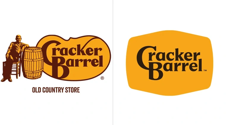
The company, which has used the same logo for more than 55 years, unveiled a redesign in August 2025. Executives believed the update would modernize the brand’s image and attract younger customers. Instead, within days of the announcement, sales reportedly fell by more than $100 million.
The backlash was swift across social media platforms. Loyal customers criticized the change, arguing that the classic logo represented comfort, tradition and the company’s Southern roots. Many called the new design too modern and out of step with the nostalgic dining experience Cracker Barrel is known for. “The old logo has been around forever—it just wouldn’t feel right without it,” one customer wrote online.
Not all reactions were negative. Some design analysts praised the updated look, saying it offered more depth and visual detail while keeping key elements of the brand intact. Supporters argued that companies must adapt to stay relevant in a competitive restaurant industry.
Industry experts say brand identity changes often come with risks. “When a company has built loyalty over decades, even small changes can feel threatening to longtime customers,” said a retail marketing professor at the University of Tennessee.
Within a week of the rollout, Cracker Barrel acknowledged the controversy and announced it would return to its classic logo. Executives said they would continue to explore ways of updating the brand but emphasized that customer trust remains their top priority.
The episode serves as a reminder of the challenges companies face when balancing tradition with innovation. For Cracker Barrel, the familiar logo remains for now, while the debate over how far a brand should go in reinventing itself continues.
(AP News)
(Forbes)

